I was recently called out on Twitter for claiming that Electron-based Slack, with three teams configured, regularly takes 30+ seconds to load. They claimed that I was either committing gross hyperbole, or the victim of some localized problem. I responded by sending over a video of me opening Slack and loading each of my teams in succession. It was 45 seconds long. My claim is that this sort of loading time isn’t unusual at all. It’s just that we’re all used to it.
Modern applications and interfaces frustrate me. In today’s world every one of us has the awesome power of the greatest computers in human history in our pockets and at our desks. The computational capacity at our finger tips would have been unimaginable even to the most audacious thinkers of thirty years ago.
These powerful devices should be propelling our workflows forward with us gangly humans left barely able to keep up, and yet, almost without exception we wait for our computers instead of the other way around. We’re conditioned ourselves to think that waiting 30+ seconds for an app to load, or interrupting our workflow to watch a half second animations a thousand times a day, are perfectly normal.
The rise of the web
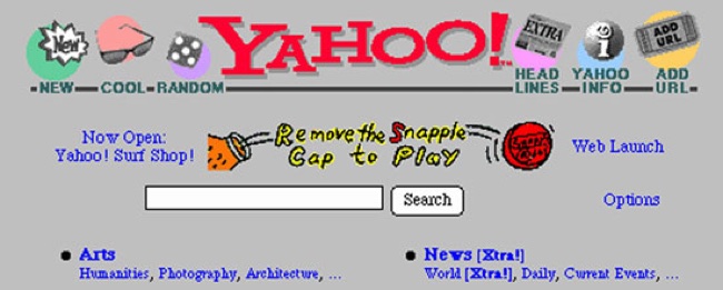
Somewhere around the late 90s or early 00s we made the decision to jump ship from desktop apps and start writing the lion’s share of new software for the web. This was largely for pragmatic reasons: the infrastructure to talk to a remote server became possible for the first time, good cross platform UI frameworks had always been elusive beasts [1], and desktop development frameworks were intimidating compared to more approachable languages like Perl and PHP.
The other reason was cosmetic: HTML and CSS gave developers total visual control over what their interfaces looked like, allowing them to brand them and build experiences that were pixel-perfect according to their own ends. This seemed like a big improvement over more limiting desktop development, but it led us to the world we have today where every interface is a different size and shape, and the common display conventions that we used to have to aid with usability have become distant memories of the past.
Today, web apps are still being hailed as the future. With the possible exception of mobile, most software companies are building their products for the web, and even when they’re not, web technology is considered a reasonable alternative for the desktop. Vocal groups proclaim that Electron-based apps convey huge benefits compared to traditional options in productivity and flexibility, and are the way forward for all desktop software.
I’m not on a mission to demean this technology, but as it’s continually augmented with ever more unwieldy retrofits, there’s a widening disparity between what we can build with it compared to the best-written native apps. Software on the web today takes too long to load, depends too heavily on synchronous calls to slow networks, overemphasizes visual gimmickry, and lacks the refinement that allows mastery by more experienced users to gain huge leverage for productivity’s sake.
The worst kept secret
In 2007, after releasing the iPhone, Steve Jobs told developers that they could all write apps for the iPhone today … as long as they did it in HTML5. To his credit, he reversed his position inside a year after realizing how compromised the web experience was compared to native options.
In 2012, Mark Zuckerberg ignited JavaScript proponents everywhere after announcing that Facebook’s biggest mobile mistake was focusing on HTML5. Meanwhile, consumers everywhere celebrated as they were given a native app that was far faster and more responsive.
Every one of us knows that when it comes to a smartphone, we’d use a native app over an in-browser HTML5 any day of the week. Yet when it comes to the desktop, we’re still using Gmail, Reddit, Trello, and JIRA. Computers and networks tend to be fast enough that this software is “good enough”. Tellingly though, we avoid this software whenever better options are available, like with our terminals and text editors.
Not just technology
Web technology isn’t conducive to fast and efficient UIs, but that’s not the only problem we’re facing. Somewhere along the way UX designers became addicted to catchy, but superfluous, interface effects.
Think of all the animations that an average user sits through in a day: switching between spaces in Mac OS, 1Password’s unlock, waiting for iOS to show the SpringBoard after hitting the home button, entering full screen from a Mac OS app, or switching between tabs in mobile Safari.
I liked every one of them the first time. The next five thousand times were less impressive. And the same goes for all the flourishes in this class – they look great in screenshots and demos, but don’t advance our ability to be productive; in fact, they do the opposite.
I live in fear that one day Apple will realize that they’ve left a gaping hole in their UX strategy and that task switches from Cmd + Tab should be animated. Multiply that animation’s length by the average number of task switches per day by the number of users by their cost per second, and you’d be able to see that millions of dollars a year in global productivity has evaporated overnight.
Animations are a particularly egregious visual gimmick, but there are others: whitespace so extravagant that only a minute amount of content can fit on the screen, overly large font sizes, submenus where a row of links would do just as well, unlabeled icons that look neat but leave their users guessing as to what they do, fixed headers that obscure content. The list goes on.
ThemWare
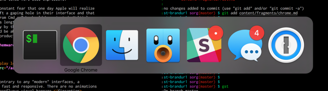
Many of us developers are building web applications for other people while simultaneously eschewing them ourselves as much as we possibly can. While our users move at glacial speeds through pages on the web, we’re sitting in terminal environments that aren’t just fast, but come with the promise of incredible advancements in productivity to anyone willing to spend the time to master them.
Here’s why I like using terminals and terminal programs:
Startup/loading time is negligible.
Time to transition between different screens is instantaneous (no animations in sight).
Interface elements are limited, but uniform.
The learning curve is steep, but rewarding. They’re optimized for the experienced user rather than the first timer. Given that successfully onboarded users may spend tens of thousands of hours in the UI over the course of their lifetimes, this is just good sense.
Composability: I’m far from a zealot singing the praises of the Unix philosophy, but most terminal apps produce output that I can process in some way to get into another program. It could be way better, but it’s leaps and bounds over what I can do on the desktop. Even copying text out of a modern web app can be a tricky proposition if HTML elements aren’t nested optimally.
The principles of interface design
If you ask a web designer about the elements of practical design in interfaces today (I say practical to disambiguate from vague design tenets like Dieter Rams’ ten principles of good design), they’d talk to you about text legibility, intuitiveness, and whitespace. I’d argue that we’re optimizing for the wrong things. UIs that are pretty and friendly are nice to have, but the true values of a good interface should be speed and efficiency to make their users as productive as possible.
Let’s dig into it by looking at the aspirational interface concept from a great movie: Minority Report. Here’s a video of it in action.

I think we can all agree that the interface of this prospective future is incredible and desirable, but if we drill into it, what’s its most amazing aspect?
Years ago, I might have said that it was the wafer thin screens. Or the incredible touch technology. But we have both of those things now! In fact, what we have today is better; we can display more than two colors on screen! Far superior to anything they seem to have in Philip K. Dick’s dystopian future.
Today, by far the most amazing aspect is that it’s an interface that’s keeping up to its user. Instead of waiting on the computer to think about some text completion, show him an animation because he’s switching an app, or start up a program, it’s keeping up with everything he tells it do in real time. The computer waits on the human rather than the other way around. Besides terminals and a few other pieces of fringe technology, modern UIs don’t even come close to a future this fantastic.
A successful interface isn’t one that looks good in a still screenshot, it’s one that maximizes our productivity and lets us keep moving. Legibility and whitespace are great, but they’re of vanishing unimportance compared to speed and responsiveness.
The road ahead
Neither a terminal nor today’s web apps are what the future should look like, but the terminal is closer.
Unfortunately, terminals also suck. Although better than the alternative in many ways, they’ve failed to keep up with any advancements from the last thirty odd years. Here’s a few places where terminals could stand to be inspired by web technology:
Rich media elements: images, videos, tabulated results, etc. The terminal has needed an answer to these since 1985, but still doesn’t have one.
Fonts. Monospace is the best family of fonts for programming, but is objectively terrible for reading. We should be able to mix fonts within a single terminal interface for optimal legibility.
Whitespace and line-height: used in moderation, these do help make UI elements more distinctive and text more legible.
Terminals also need a lot of other things before they’re ever going to a plausible interface replacement for most people. UI elements that aren’t built around ASCII bar characters for example.
We need a reboot. We need toolkits that produce interfaces that are fast, consistent, bug free, and composable by default so that good interfaces aren’t just something produced by the best developer/designers in the world, but could be reasonably expected from even junior people in the industry.
We should be honest with ourselves and call out design anti-patterns that promote flashiness at the expense of efficiency.
We should stop babying our users and try to raise beginners and the less technical to the bar of modern day power users rather than produce software that’s designed for the lowest common denominator. We need more applications like Vim, Emacs, and Irssi that push their users to improve and pay huge dividends to those who are willing to make the effort, and we need to train people to use them.
We should build networked applications that cache content and make network fetches asynchronously to remote APIs so that humans aren’t waiting for data to come back over the wire while they’re working.
There’s a future out there where our software makes everything from filing a bug to paying off your credit card fast and efficient, but the path that we’re on today isn’t it.